Book Cover Design Trends 2017
Everyone knows the old saying, “don’t judge a book by its cover”. While the quote is a metaphor that relates to human emotions, it doesn’t work too well in a literal sense. A book, regardless of how well-written it could be, will never be read unless it attracts a reader’s attention. Book cover designs have become a fashionable thing. From simplistic calligraphy to quirky design patterns, book covers are getting the royal treatment with remarkable makeovers. Book cover designs are starting to move away from the monotonous text, colour and artwork approach to something that is more personal to the author. In fact, self-published authors are taking book cover designs seriously, even as a method to distinguish one book from another when they plan to write a book series. Every year, trends across industries tend to evolve or change outright, and the book publishing industry is no different. Here are some cool book cover design trends in 2017.
Elements of a good book cover:
A book cover is not complete without mixing, matching and blending certain elements. You don’t necessarily have to perfect all the elements, but getting a few of them right, especially those that go well with the theme of your book, will work wonders for the promotion and marketing of your book.
Front Cover:
- A concise title: Needless to say, the title helps sum up what your book is all about. Unless you’re going the full-text route for your front cover, keep your title within a limit of four words. Standard font options for the title include Helvetica and League Gothic.
- An SEO-friendly subtitle: If necessary, add a short subtitle in the front cover. A subtitle is a helpful SEO-friendly tool used to give your book visibility in the immense amount of competition the world of books and the online world, in general, has to offer. Before settling on a subtitle, do some research on the most commonly searched words that fall close to the theme of your book.
- A relatable cover design: The actual design of the book – the colours used, the images placed in and the overall look and feel – all need to be carefully considered before you decide on the final blend. Most authors base their designs on the story of their book – whether it’s the central plot, main character or theme.
Back Cover:
- Summary of the plot: Avid readers have a habit of glancing through the back cover for a quick preview of what is to be expected of the book. Make sure your summary is at least one third of the total number of pages in your book, and write it in a suspenseful fashion to keep readers intrigued for more.
- Testimonials: Testimonials are becoming a super essential part of a book cover simply due to the fact that it helps in marketing the book. If you’re lucky enough to get some good early reviews before your book goes public, do make it a point to include them on the back cover.
- Author Bio: The inside of the back cover is reserved for a little self-promotion, so try your best to include a good write-up about yourself that can nudge readers to read more of what you have or excite them for more that is to come.
- The price of the book: Pricing is another element readers normally glance at within the first ten seconds of picking up your book. Pricing your book can be tricky; you’ll have to be certain that the price you stamp on your book is worth every word that is written while also making sure you’ve covered up on the spends for editing, designing and marketing your book.
A quintessential novel is the perfect amalgamation of the above-mentioned factors. To take things up a notch, you can check out our extensive guide of book cover design tips to make an exceptional cover for your book.
Book covers designs that are making waves in 2017:
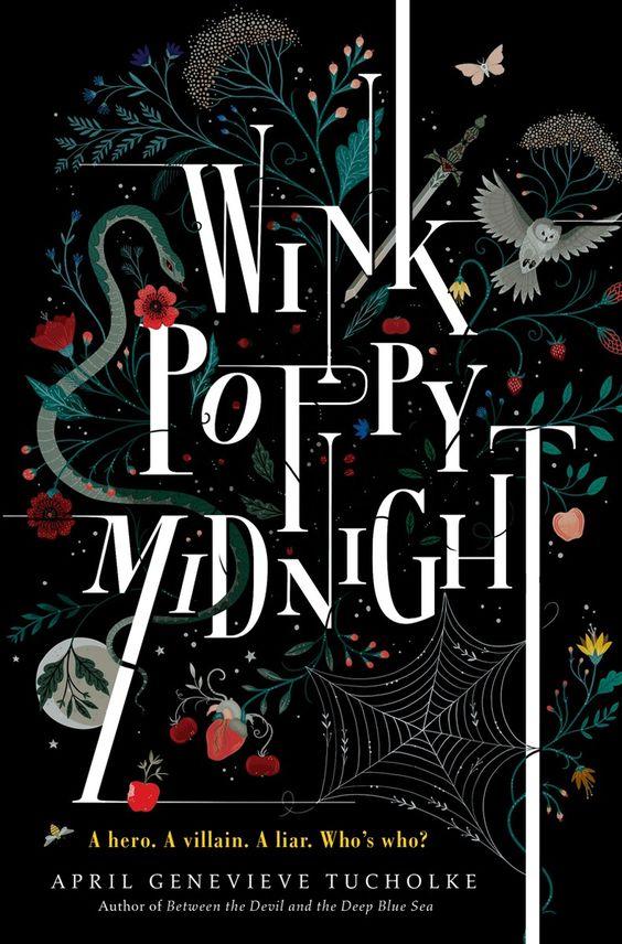
- All text: Fonts are getting more deeply explored by authors of all genres. The varying styles, sizes and colours that can be used inside the written word itself are extraordinary, and a lot of new age authors are leaning towards designing covers with text overpowering the creative.
- Abstract art: For authors who have a fine taste in art, simply picking from the standard art styles is never enough. Authors are beginning to explore more art styles that can be described as anything between quirky and outlandish.
- Single subject: If you’ve noticed magazines, you’ll see a standard trend across them all – the focus on a single subject. This subject is relative to the theme of the magazine (a person if it’s lifestyle or car if it’s automobile). Authors are taking a leaf out of the magazine trend by designing their covers to focus on a single subject – be it a plot, device or character.
- Old school is back: If your audience base is in their mid-50s, you can attract them towards your novel by creating a retro style book cover. Retro book covers keep designs simplistic yet elegant, saving you the trouble of overthinking extensive design elements.
- A burst of colours: As technology continues to move forward, colours, like numbers, are becoming limitless. If your book is an adventure novel or has a range of characters with colourful expressions, you can elaborate on that by going crazy with multiple shades of colours.
Some inspiring book cover designs:
Inspiration can come from anywhere, whether you’re looking for inspiration to write or inspiration for a good book cover. Here’s our list of the most popular book covers.
IT
It is one of the most popular horror novels written by Stephen King. The design stresses on the main subject in the novel’s plot. The cover showcases a paper boat and claws sticking out of the sewer. The paper boat is just a small part of the story, but the claws emphasise the claws of the antagonist – a clown referred to as “it”.
Egg- A culinary exploration of the world’s most versatile ingredient
This part-cookbook has a very simplistic and straightforward design that focuses on the primary subject matter – an egg. It also has randomly placed words that play as a rough scribbling of ingredients.
Cannibals in love
This cover design is by far one of the most intelligently created ones. The title Cannibals in Love perfectly blends with the design. At first glance, it may seem like a simple macro-photo of two clenched fists holding on together, but if you read the title and look at the photo, you’ll get an entirely different perspective.
Wink poppy midnight
You’ll pick up this book regardless of our explanation of it. One glance and the curiosity to read more of this book just erupts. The oddly named title and vivid colours make a must-have-on-my-shelf collection type of book.
Thus bad begins
The theme of this book is dark, the story is controversial, and the cover undoubtedly reflects them both. The woman on the cover is the secondary character, and the entire tale focuses on her interactions with the story’s protagonist.
If you’ve completed writing your novel and require a little help in the design of your book, contact Notion Press – a highly regarded self-publishing agency – that will help you deign the best cover for your book through their diversified design packages.


